
Pivot table helps the user to expand, isolate, sum, and group the particular data in real time. It can show you the differences in very big data sets and helps in organization of large amounts of data in Excel
Steps to create a Pivot Table:
- Select any Cell from the table you want to create the Pivot Table
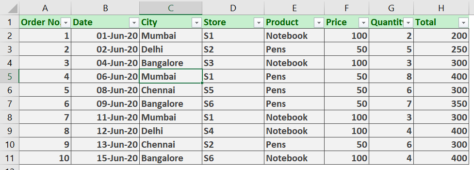
We have the above data set with us for this example.
- Go to Insert Tab -> Click on Pivot Table

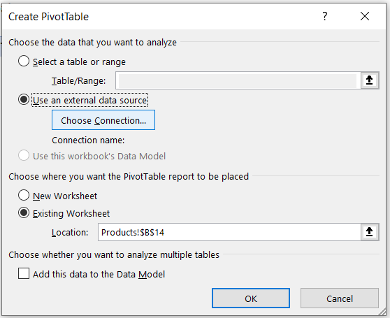
- A dialog box, Create Pivot Table appears:

Here Select the table/range by first clicking inside the Table/Range field and dragging and selecting the required range.
Then choose where you want to display the pivot table. Here we have chosen to place the table in existing worksheet to help us analyze more effectively.
And then Click on OK.
- Now the option to choose Pivot Table Field Comes:

We will choose Date, City and Quantity fields for now.
Now that your pivot table has been created it will look something like this:

Here, you can see how effectively we can analyse important information such as on a particular date, we can see the number of quantity of products sold in stores of each city.
This task would be daunting to analyse from the plain tabular database we had.
So, you have the features understood now, let us dive into making reports more fun by defining layouts for pivot tables.
Features of Pivot Table
We have a plethora of features provided along with Pivot Tables. Here we will talk about those features which are essential ones, mentioned below:
- Format Empty Cells
- Percentage of Grand Total
- Insert a Slicer
- Inserting Pivot Charts (Making a Frequency Distribution Chart)
- Pivot Table from External Sources of Data
Format Empty Cells

You can see in our source data we have blank cells due to which the pivot table also has blank cell.
This can be frustrating and prone to errors when preparing a report.
Steps to format empty cells in Pivot Table:
- Click on any cell inside the Pivot Table
- Go to PivotTable Tools Tab on the Ribbon -> Analyse Tab -> Options

- You’ll get a dialog box, PivotTable Options

Under the format label, Check the For empty cells show: and the give your desired value.
We are giving 0 as the default value as quantity is a numeric field to avoid any errors.
Then Click on OK
- Now you’ll have zeros in the empty cells.

Percentage of Grand Total
Suppose, in the above pivot table we want to express the no. of quantity in percentage to that of the grand total of quantities.
To do this, follow the below steps:
- Click on any cell in PivotTable to bring the Right sidebar of Pivot Field Options

- Click on Sum of Quantity (will differ according to your data set) -> Click on Value Field Settings.

- On the Value Field Settings dialog box, Click on Show values as drop-down list and select the option % of Grand Total. Then click on OK
You’ll now have all your data expressed in percentage of Grand Total

Insert a Slicer
Slicers are interactive elements of a pivot table added after Excel 2010. Slicers are like interactive buttons that allows the user to see what has been chosen in the pivot table.
Steps to insert a slicer:
- Click anywhere inside your Pivot Table
- Go to the Pivot Table tools tab on the Ribbon and Click on Analyse
- Click on Insert Slicer under the Filter category

- Select the desired fields to insert the slicers

We have selected Product and Store as our slicers
Yay! You now have these slicers inserted:

Now you can click on the data elements inside these slicers to show you the relevant information

Frequency Distribution (Pivot Charts)
Its as easy as making normal excel charts but they can provide valuable quick information when you do not want to disturb the main table and hence use the pivot table for data analysis which can provide greater features than a normal table.
Steps:
- Click on any cell of Pivot Table
- Go to Pivot table tools -> Analyse -> PivotChart

- Click on the Clustered Column chart and the Click on OK

We now have a frequency distribution Chart.
Remember that the data inside the pivot table should contain counts and you should format accordingly.
You can also remove certain unwanted elements from the charts by clicking on the City options which can hide certain cities if they are not necessary for your analysis.
Off course, your data will be different but the underlying concept is the same.

Pulling Data from External Sources to build up a Pivot Table
This feature is one of the most important features extensively used by organizations dealing with big data sets.
If your source data has some another location in your computer, may be in a different excel file or it may be completely situated at cloud server such as Azure, you can still pull of data from there.
You can import data into your Pivot Table from the following data sources:
- Excel workbook
- Microsoft Access database
- SQL Server
- Analysis Services
- Windows Azure Marketplace
- OData Data Feed
Let us see an example where we pull up data from another excel sheet within our local filesystem.
Steps:
- Go to Insert -> Tables -> PivotTable

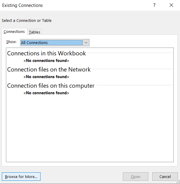
- Select Use an external data source and click Choose Connection.
- Now click on Browse for more in the next dialog
- Select the desired excel file you want to make as a pivot table in the current worksheet

Double Click on the file
- Select the table and then click on Ok

- Now give the current location of the cell, where you want to display the pivot table in the current sheet

And then click on OK.
Now select all the fields which you want to include in the new Pivot Table In the right sidebar Pivot table field
Voila! You now have 2 different pivot tables from different sources.

I hope if you have read till here, you probably learned a lot about pivot tables and its features.
We encourage you to Keep Learning!

Class-room of your choice
Upskill yourself by attending classroom or online class.

Flexible timings
Learn at your convenient time. We have a flexible schedule, which is designed to suit your learning style and pace.

Class-Room Size
With limited students in class, attention to each student's performance will be given.

Industry Ready Curriculum
The course is designed for people who want to work in the industry.